Paint Colours and Mood
How to Make your Home Feel Good
You, may not think about it every day, but room colour affects your moods and thoughts, even the way you perceive a room.
Reactions to colour can be subjective. Perhaps the colour blue makes you feel thoughtful because it reminds you of the winter sky. Thatâ the premise of colour psychology the idea that colours evoke emotional, mental and even behavioural responses, and, therefore, can impact our mood. But generally, certain types of colours produce particular responses. Warm colours like red, yellow and orange can produce feelings of warmth or aggressiveness, while cool colours like green and blue can be calming or depressing. Research points to evidence that certain colours elicit the same type of mood in most people.
Being, a paint supplier, colour psychology is a very, interesting topic for us – as we know, that the colours you choose to paint your rooms, will affect if you feel happy or sad, or if the room feels big or small.
Feel & Function
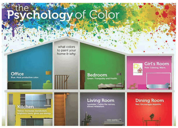
The general idea of colour psychology is pick a colour that best motivates the primary function of that room. To do this its best to first determine what the primary function of that room is going to be? What will it be used for? Who will be visiting that room and what activities will take place in that room?
Then you use colour psychology to pick paint colours that best represent the function of that room.
To add, a more personal touch, close your eyes and imagine the room, once it’s decorated. How does it feel?
Warm vs Cool Colours
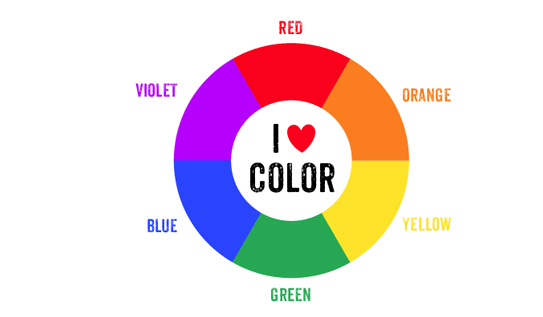
The colour wheel consists of 6 basic colours: red, green, yellow, blue, orange and violet. When you divide the wheel in half you end up with warm vs cool colours. A balance is best achieved both warm and cool colours.
Warm colours are:
- Red
- Orange
- Yellow
Cool colours are:
- Green
- Blue
- Violet
Warm Colours and Colour Psychology
These colors are radiant and cozy, they tend to make you think of things such as sunlight and heat. Because warm colors seem to advance, they make small rooms appear smaller and large rooms more intimate.
Best to use in a bedroom.
Cool Colours and Colour Psychology
These colors can have a soothing and calming effect, they tend to make you think of things like water, sky, ice and snow. They make rooms feel colder, and small rooms appear larger.
Best to use in a small room or a room with natural light.
Paint Colours and Their Applications
Mood Colour: Blue
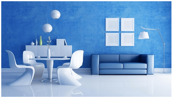
Blue is everyone’s favourite colour for a reason. It’s a constant in our lives, between blue sky and blue water, colour expert Kate Smith says. There’s a real trust factor with blue.
Blue improves focus and productivity, Its calming effects are said to slow down respiration and heart rate as well as lower blood pressure.
The relaxing effects of blue are particularly felt with lighter shades; darker shades of blue can trigger feelings of sadness and all blues can appear a little chilly, especially in rooms with little natural light.
Blue is ill-suited for areas like the kitchen or dining room because it can curb appetites.
Best room to use blues in:
- Children’s study and offices
- Bedrooms
- Bathrooms
Mood Colour: Green
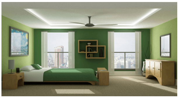
Green is the color of nature and is considered the most restful colour for the eye. Because of its association with nature it evokes feelings of tranquility, healing, growth, renewal and rebirth. Because of our human history – the human eye can actually see more variations of green than any other colour because our ancestors had to be able to detect the slightest changes in the landscape surrounding themselves in order to stay on guard. Green is also a mix of blue and yellow so it combines the cheerfulness of yellow with the calming effects of blue. It encourages unwinding but has enough warmth to promote comfort and togetherness.
Best rooms to use green in:
- Bedrooms – green is believed to help promote fertility making it an excellent choice for this room.
- Bathrooms
- Family or living rooms
- Can be sued in the kitchen to cool things down.
- Yellow-greens or blue-greens can make a workout area or office space feel happier.
Mood Colour: Purple
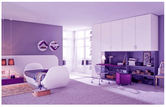
Purple is a combination of red and blue, so it takes on different forms depending on the shade that you use. In lighter shades ie Lilac or Lavender bring the same restful quality blue does. Darker shades such as eggplant give off a rich, dramatic and sophisticated feel that is associated with luxury, royalty and creativity. Purple is also associated with mystery and eccentricity. It used to be favoured by women, but more and more men say they’re drawn to purple these days.
Best rooms to use purple in:
- Bedrooms – Lilac or Lavender work similarly to blue — evoking feelings of relaxation and rest without the risk of feeling chilly.
- Kids rooms.
- Dining room – darker shades – take on more energetic tones
- Any room you want to stimulate creativity in – purple stimulates the imagination.
- Any room you want to make appear more luxurious.
Mood Colour: Yellow
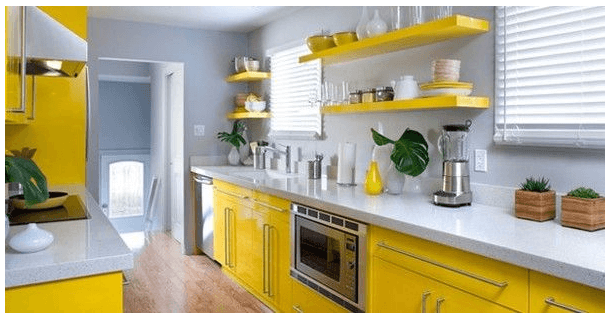
Yellow is associated with summer and sunshine – therefore it stimulates optimism and happiness. Yellow has been shown to stimulate thinking and improve metabolism. However, bright yellows or an overwhelming amount of yellow in a room can cause frustration and anger. For example, studies found that babies cry more and people are more likely to lose their temper in yellow rooms. Soft, buttery yellows are easier to live with in the long run – they are easier on the eyes and more calming than bright yellows. Yellow reflects light and is perfect for poorly lit rooms.
Best rooms to use yellow in:
- Kitchens and dining rooms – Is a chatty and energetic colour.
- Bathrooms – its an energizing and uplifting colour.
- Halls, entries and small spaces – yellow can feel expansive and welcoming.
Mood Colour: Red
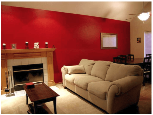
Red is the most intense color, bursting with excitement and energy – is the most psychologically stimulating of colors. Studies have found that it can increase adrenaline, raise blood pressure and speed up your heart & breathing rate. It’s a great choice if you want to stir up excitement and lively conversation in a particular room. It also increases the metabolism and therefore the appetite – makes you think why all those restaurants have red walls now, doesn’t it?
Best rooms to use red in:
- Dining rooms or living rooms – it draws people together and starts conversations.
- Other rooms where people gather
- Red makes a great accent color because of its ability to draw attention (think of a stop sign)
Mood Colour: Orange
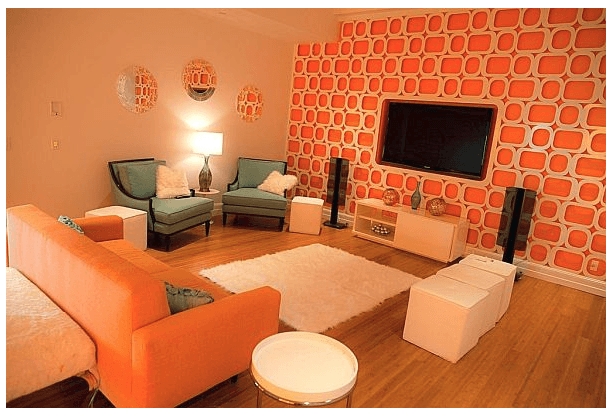
Orange combines some of the traits of red and yellow. Like red, orange is a high-energy color with a sense of enthusiasm. Like yellow, orange is a warm, friendly and welcoming color – more so than red. In ancient cultures, orange was believed to heal the lungs and increase energy levels.
Best rooms to use orange in:
- Kitchens
- Dining rooms – also stimulates appetite.
- Exercise rooms – energetic colour.
- Guest room – warm and friendly colour.
Address
19 Jansen Rd
Nuffield Springs
Gauteng
Call Us
(011) 818 2247/8
(082) 412 7170